Every now and again you play a game that takes a couple of moments to get the hype and that couldn’t be more true than with TUNIC. A Zela inspired gem of a game.
I’ll be honest and the first time I booted TUNIC I wandered around for 30 minutes and made little progression with zero sign of what I should be doing, or where I should be going. I got to a point and it looked like I was stuck. So off it went and to bed I go.
Now I’d like to say I went back in fresh the next morning and just got it… But in all fairness I was dreading it. I was going to have to lay on the criticism thick and proclaim another highly anticipated title was going to be a bit rubbish.

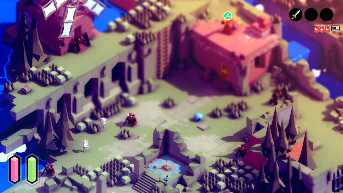
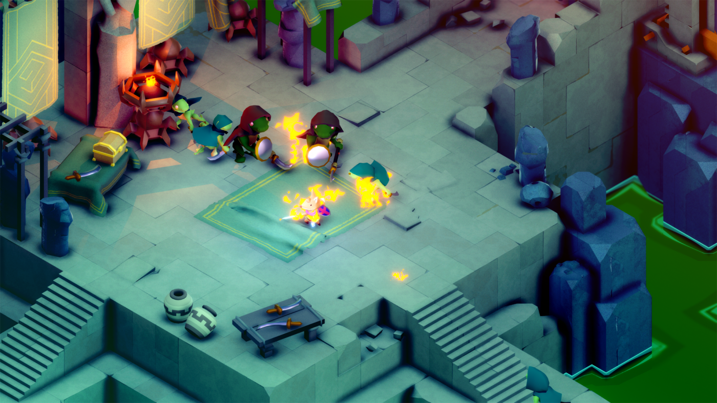
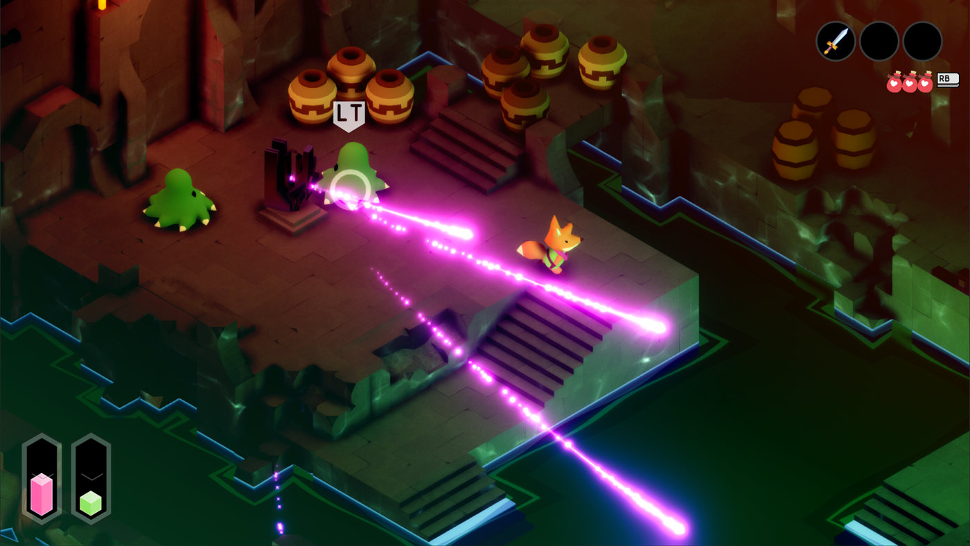
Sure it looks lovely, like really lovely. Don’t let those cute visuals trick you though, TUNIC is a bastard of a game. It seemed to want to funnel me down a path where I would have my single stick and had little chance of progression.
Paths were blocked off, yet obvious they were to open up at some point. Enemies were destroying me and every route seemed like a dead end. However developer Andrew Shouldice is a clever person. Even during my opening frustrations there are little hints of what you should be thinking. Not signposted, not even telegrapheed but very subtle and very clever.
I stumbled upon a hidden path accidentally and though that was the way I should go. But no, this was merely the game hinting that maybe, I should backtrack and think outside the box. Which I did and I never looked back. Well until I had to to move forward that is.

Look, if you have played a Zelda game, suc h as Linked to the Past, Link Between Worlds, etc then you’ll get the concept. As you progress you unlock things that help you do new things to get things you couldn’t get before.
There is no dialogue of note in TUNIC and the music is dialled back to the point it enters your subconcious more than anything. Giving you little cues that you don’t realise are there. It is stunning in that respect.
TUNIC is a fairly linear game, but with the opportunity to really explore and discover the world’s secrets. Going off the beaten path is encouraged with little visual hints that there could be something worth it. The slight glimpse of a treasure chest is enough to get you exploring as is the sight of an out of reach enemy.
You also get an experience that has a story to tell but not in a traditional way at all. From the moment you start, you are given nothing and the slow methodical unwinding of the world around you also gives you a tale that starts to make sense the further you go.

As usual I will avoid any story spoilers but I will say that I was fascinated by what the game had to say and what it also left out and to my own imagination.
TUNIC is a slow burn of a game nut one I will remember for many, many years to come. The little fox you control is adorable, the visuals and the sound just are perfect and the whole experience left a mark in a way many games haven’t in the past.
This is best Zelda game you will play this year that isn’t named Breath of the Wild 2. You owe it to yourself to try this. Don’t wait for Game Pass or4 anything like that. Pay good money and get a great game.
Accessibility Notes
As is going to be the way forward Ishall cover accessibility at the end.
Note: I talk as someone with visual impairment and ADHD so there may be other accesibility issues that affect others in different ways. I am not underminding them, I just cannot comment on them from experience.
There is little to no dialog in TUNIC so that never really becomes a barrier. The text on the whole if nice and chunky making it easy to read. However the ‘instruction booklet’ is crowded and hard to see. It is also very jumbled which I struggled to get my head around with my ADHD. I got lost pretty easily.
There is a lot of ‘code’ that you need to discover before it read in English which is part of the game, but there has been no attempt to differeniate between that and useful text with colour and/or opacity. A little thing that would have made it easier.
The game itself is wonderfully balanced in the visuals, the subtle colour difference are enough to make it look nice, but not so subtle I couldn’t see what I was doing or where I was going. Enemies stood out on the background making it possible for me to see them.
There are mainly visual cues to spot their attack patterns and it would have been nice to have other ways to make these attack patterns known to those who need them. But it wasn’t terrible.

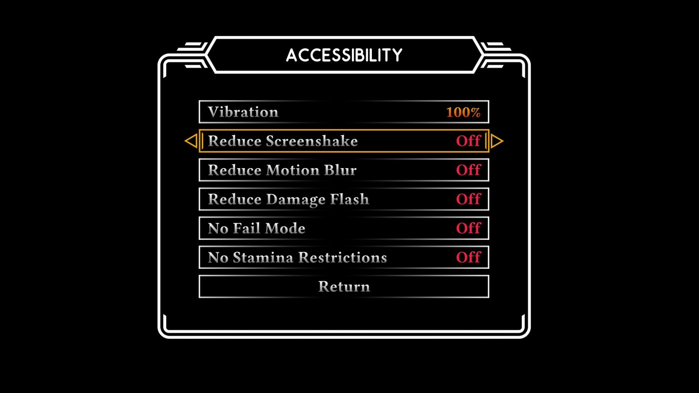
In the accessibility menu you can reduce screen shake, motion blur, damage flash and change the vibration levels. Also there is a no fail mode and the ability to turn off stamina restrictions.
There could be more options as always but whilst these options aren’t aimed at me, they are a decent start.

